Syndicated post from InmanNews.
Source link
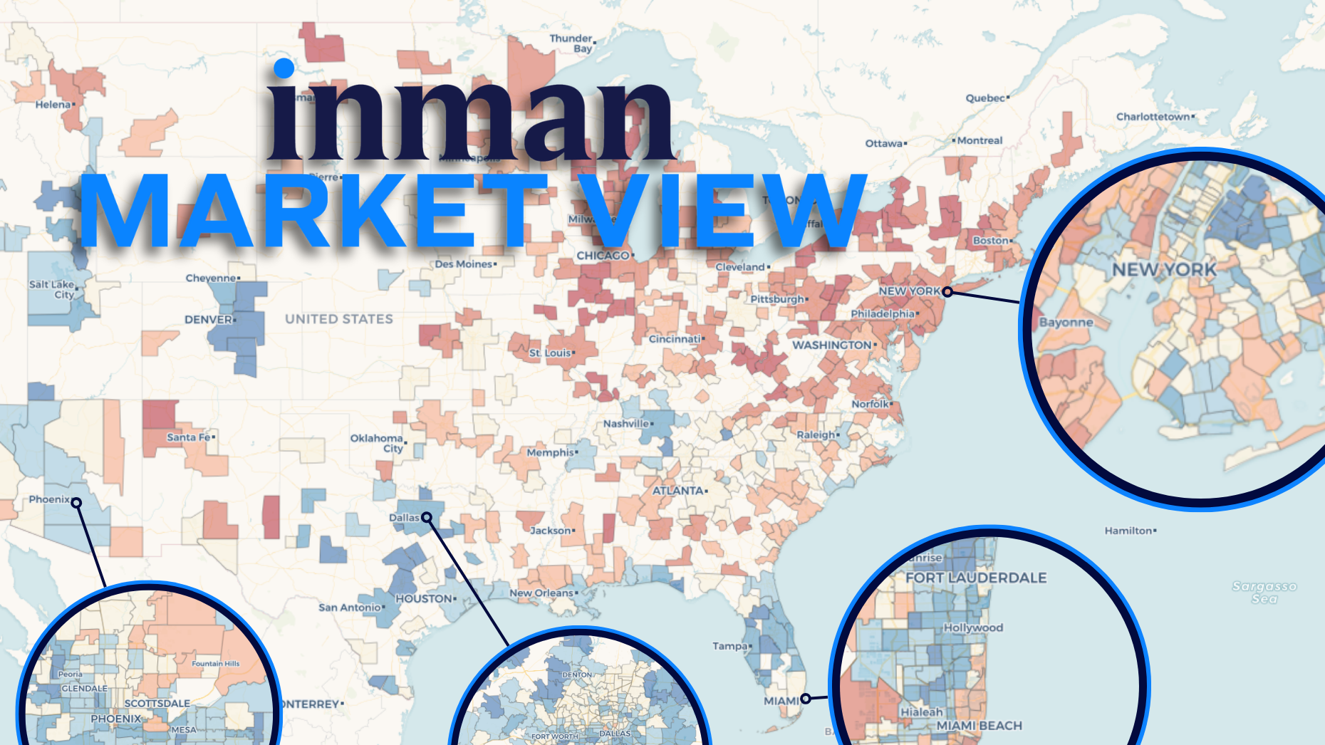
It’s not just the biggest inventory gainers that have seen their stream of for-sale homes slow. Some of America’s most listing-starved metros are once again losing ground. Dive deeper with Inman Market View’s interactive maps and charts.
Since the number of new listings bottomed out years ago, many local housing markets have seen a gradual influx of supply that has helped rebalance conditions in favor of buyers.
Now, that pace of recovery is slowing across the country — and may even be topping out in places where the inventory recovery has been most pronounced.
But some of the markets where new listings have become harder to find in recent months already had a heavily depleted supply to begin with, keeping prospects of buyer-seller parity far out of reach, an Inman review of Realtor.com data suggests.
- The growth rate in new listings fell from 3.8 percent year-over-year in the three-month period ending in October to 0.6 percent in the three months ending in January as the market continued to stabilize.
Explore the Inman Market View interactive data tools on this page to see how your market compares.
Click into one of the 500 local markets in the tool above, or search for an option from the drop-down menu for an even more detailed look at the data. Select different metrics and time-period comparisons for a fuller picture.
Coast to coast
The interactive map above is significantly less blue than it was three months ago — especially in the West, the Northeast and several major Midwest population centers.
This means that some coastal communities that were once seeing noticeable year-over-year listing gains in the fall started topping out in the winter. And places where new listings were holding steady a few months ago are now losing ground.
For real estate professionals in these regions, the loss of new-listing volume is particularly painful.
In the West and the Northeast, the supply of newly available homes for sale never really recovered after the initial downturn as sellers sat out of the market.
In the Midwest and Northeast, as seen above, inventory has remained extremely supply-constrained even as buyers stopped bidding on homes. This has ensured that markets like the greater Chicago, New York and Philadelphia metro areas have not matched the national pace of recovery in active listings.
And that situation doesn’t look likely to improve any time soon as these three cities, like many others throughout the country, are now seeing new-listing growth rates weaken.
In the Northeast, these conditions have largely served to prop up the substantial price growth that helped real estate owners and brokerages weather a steep transaction downturn.
But Chicago and a number of high-priced West Coast markets were largely left out of the national boom in home prices to begin with. And even steep losses in new-listings haven’t served to push prices much higher.
But just because new-listing growth is weakening in these metros doesn’t mean it’s happening everywhere.
You can use the charts above to search for your own market and compare its trajectory to others across an array of metrics and time comparisons.
The neighborhood view
In Chicago, 11 percent fewer new listings came on the market from November through January than during the same period the year before.
And it’s notable just how widely this slippage was felt throughout the greater metro area.
Most local housing markets aren’t in Chicago’s position. About half are still experiencing healthier listing levels than the year before and have pockets of growth and slippage throughout their central cities and suburbs.
But the new-listing recovery that characterized the rebalancing era of the pandemic recovery is increasingly slowing in more places. Plug yours into the tool above for a deeper look.


